Tuesday, 12 February 2013

12/02/13- Beyoncé

How do media producers use intertextuality to attract audiences to media products by broadening the possible Uses & Gratifications?

Beyoncé's video 'Countdown' shows all the elements of Uses & Gratifications but, they are not all easy to point out. The obvious Uses & Grats noticed by looking at the video would be, Personal identity because, her fans/people who watch the video would become amused by what she is wearing and it would encourage them to buy the same clothes as Beyoncé, what she wears in the video. Another element that is noticed in this video is Entertainment. This is because, audiences would have loved Beyoncé's songs and would definitely want to watch the videos to them to see what she is like in them. Lastly, Social also comes into this because, most groups of friends/people, would try and copy what she wears, how she dances and would try and be like her while others may think she is too rude the way she dresses or maybe, they are not into her kind of music as it might be a little too 'jumpy' for them. 

Beyoncé has in fact, copies the choreography from a film with Belgium dancers. She has taken this, so that the fans of those dance moves would definitely watch Beyoncé's dance moves and she would get a larger audience. Also, people would compare the two videos to see who danced better and to recognize Beyoncé. 
Beyoncé did not just 'steal' dance moves but she also stole the clothes and the colors from someone called Audrey Hepburn. As you watch the video, you can notice very bright summery colors which meant that the fashion at the time was bright colors due to the time of month when this video was out. This brings back the 50's/60's and it is recognized by many. 

An Information element has been recognized but, it was not that easy to point it out. This is because, when Beyoncé sings in the video, at one point when she sings 'I'm tryna make us 3 from that 2' and she turns halfway and shows off her baby bump which informs us that she is pregnant, but she is very clever in this way. 

The setting is also similar to the one in the film Step- Up, with the windows and the atmosphere seems really old. Beyoncé has used all the elements in different ways in her music video which brings back the 50's/60's as its tradition. 

Sunday, 10 February 2013

10/02/13- Intertextuality in Film

Intertextuality in Film

  • Dialogue
  • Action 
  • Locations
  • Specific shots
  • Conventions
  • Narrative
  • Stereotypes
- People like making links with other films, because doing this will encourage the audience to watch it by recognizing where a specific scene, location, dialogue has come from. 

Uses of e- media [new media tech]
  • Websites ----> Blogs ----> Social media
Social networking sites help a film become viral all over the internet by loads of people speaking about a particular film, it gets the other audiences interested and they keep updating specific facts about the film. Once the film is released and many people have watched it, they tend to review/ rate it online- giving the people who have not watched it, a rough idea on how they liked/disliked it, and what could be improved about it. Most people tend to use social networking sites as in Twitter, Facebook, Tumblr etc as they are easy to use and it enables people to post pictures up of whatever they want. 

Websites are also very practical and most films nowadays, have their own official film websites such as; The Hobbit, Skyfall, The Avengers Assemble, The Amazing Spider-Man etc. This helps interact with the audience and keeping them posted about any teaser posters, trailers that they should look at to find out more about the film. Some people actually make fan sites of certain films that they had really enjoyed/ or become a fan of. For example, there are many fan pages for Harry Potter, Twilight films etc as people have become somewhat obsessed with these types of films. This helps a specific film stay on top of things by giving excellent reviews and ratings which encourages more and more people to watch it. 
  • 3D- Why does it make people want to consume it?
It brings out the action that goes on in the film much more than watching it on regular definition. It amuses the audience more by watching it in 3 Dimension. The audience feels as if they are included in the movie which makes them feel excited. 
  • DVD- 
If a specific film is liked, the audience can watch it over and over again especially, if they are doing a project and must watch specific scenes or analyse the film. By watching a film in the cinema, sometimes you tend to forget what happened and when the DVD of a film comes out, majority of people go and buy the DVD so they can recapture what happened. 
  • Blu Ray- how it attracts the audience. 
Blu Ray is basically, when a film is shown in a High Definition (HD) experience. This attracts an audience by showing every detail in that film and so, it also makes the graphics used stand out. The audience will enjoy the movie more if it is in a higher resolution. Blu ray could also give an illusion Blu ray also provides a better sound quality i.e. surround sound, which will gives that incredible audio. Every film looks better and sharper in Blu ray form as it brings out the detailing, colors and graphics used. 


10/02/13 Media Theories

Media Theories

- Effects theory

What the Media does to audience. For example, a violent video game could cause more violence in reality amongst people who play them. 

- Uses & Gratifications theory

What audiences do with the media (why you play it, watch it, read it etc). How the media influences them, people use media to fulfill their various needs.

- Reception theory 

What audiences do to the media.

The role of role models: 
  • Fashion
  • Celebrity
  • Association 
  • Sense of group and belonging
  • Makes reception easy in social context 
- Effect theories
  • Mass Media/ mass communications make people powerless to resist messages the media carries. 
  • Consumers are 'drugged', 'addicted' or 'hypnotized'. 
  • Effects theories taken up with protection of young, link between violence and the media. 
  • Rise of TV in the 50's and 60's- fear of danger to children by inappropriate content in most media.
-User Generated Content- UGC
  • We may not have choice about what we watch
  • Neglects any aspects of effects theories 
  • Neglects socio- economic factors. 

Saturday, 9 February 2013

9/02/13 The Green Hornet Poster


Poster analysis of The Green Hornet


This poster above, shows two men, who are obviously the main characters of this Action movie. It shows them dressed in black and have masks on their face which show that these faces are hidden and creates suspense for the audience. They also look quite suspicious as their clothes are dark in color and one of them is holding a gun in his hand, in fact, they look like criminals. There is also a green car behind them which seems to have green headlights which refers to the title of the film 'The Green Hornet'. This brings out the green and makes it stand out at the back. The green headlights emphasizes the two masked vigilantes in front of it, which also brings out the color Green in more detail. 

The fact that '3D' is written just beneath the main title 'The Green Hornet' hints to the audience that they should watch this film in 3D as, the graphics used, perhaps would look better in that Dimension. This assures the audience that watching in 3D shows that it would be a very good, Action criminal film and so, it persuades the audience to go and watch it. When using the 'Z' reading, the first thing that audiences will read would be the name of the actors/actresses starring in the film. Then, by reading across, we can see the image of the two men, with the car behind them. This gives the audience the background of the film, by showing two suspicious men which indicates that this film is of an Action/Crime genre. Then finally, going across again, we can read 'The Green Hornet' title and we can see 3D, also the release date last. The way that this poster has been made, reflects on how audiences will look at this poster and so, will take in a bit of information on what the film is actually about. 

At the top of this poster, there are names of the main actors, all of which are well- known like Cameron Diaz for example. The benefits of putting actors/actresses' names at the top of a poster is to assure that these specific actors are going to be in this film and so, it will get the audience more interested. At the bottom of the poster, there is the release date in Bold which makes it stand out and the audience would know exactly when the film was coming out in the cinemas. At the bottom, there are also faint colored credits which you can barely see, this shows that these credentials are not important in this poster and the rest of the additional information is important to the audience. 


Wednesday, 9 January 2013

Poster Analysis of The Avengers

The Avengers poster analysis


This is the teaser poster of The Avengers Assemble. The colors used in this poster are very dark, dull colours which shows that this film is a movie which is linked with outer space and the earth. The colours also refer to the name of the film; 'The Avengers'. The poster shows the four main characters or in fact, the four main Avengers and so, the audience gets to know what the Avengers look like and what part each of them are playing. 

The target audience of this particular teaser poster would be superhero fans whether children or adults, as all the avengers have their separate films which most people would have enjoyed. Also, fans of a particular avenger; for example, Iron Man, Captain America, Hulk, Thor etc. 

There is not much information provided on this poster and it doesn't include much about the film. However, in the bottom left hand corner, there is listed three of the institutions of the film. This gives information about the institutions of this film. Also, there is a catchy tagline right at the bottom underneath the year that this film was released. 

It says; 'Earth's Mightiest Heroes', which encourages the audience to look forward to this film. This tagline also links to the image at the bottom of the poster of Planet Earth. This automatically comes to mind, that this film is about superheroes that avenge the Earth and protect it. 


This poster is the original Avengers Assemble poster in which, you get to see Action occurring by looking at it. The colors in this poster aren't dark and dull like the teaser poster, there are colors included of the costumes that the actors are wearing. This helps the audience view what the colors of the costumes will be and, they also get to see all the superheroes involved in this film.Whilst using the 'z' reading technique, the first things you see are the superheroes in Action which is the main focus of this poster. 

This poster is also more appealing than the teaser because, you can see more action going on and, you are able to see the main characters faces in their costumes. However, there is no information provided on this poster. This would possibly be because, the audience would have already known about the film release date, actors names and institutions from the previous posters and trailer. There is also no name of the film included in the poster because majority of the audience would already know the name of the film, by identifying the characters. 

This poster has been designed so that the main focus of the attention are the Avengers themselves. Lastly, by looking at the background, you can see there is a serious fight going on in which the Avengers must protect themselves, others and of course, the Earth. There is a car behind them on fire that is turned over and the atmosphere is destroyed. This suggests, the place where they are all standing will be a mess in the film as well. You can also see the Stark tower right at the back, which is also in the focus. The audience would suggest that Stark tower is also the main focus of the film, which is why it has also been shown in this poster. 


Tuesday, 8 January 2013

My 3 Core products

3 Core Products

The Avengers 


The Green Hornet


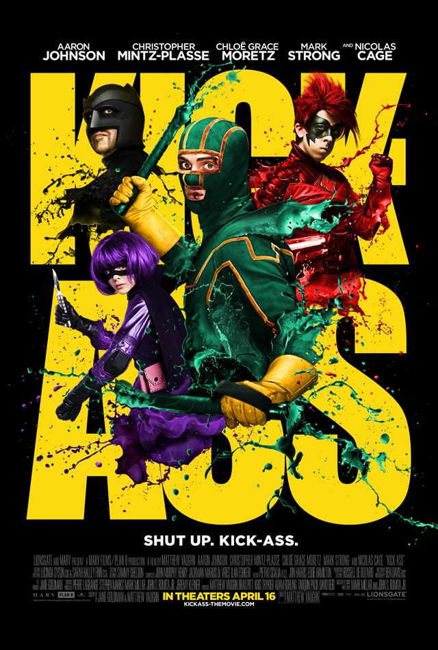
Kick-Ass

Case- Study Outline Kick- Ass

Case- Study of Kick-Ass  

The budget: $30,000,000 (estimated)
The gross: $48,043,505
Director: Matthew Vaughn- English film producer and director of Stardust, X-Men First Class, Layer cake. 
Institution: Marv Films and Plan B Entertainment
Style of Marketing: Posters, Trailers, Online, Media and Publicity. 

This film had released many posters of the colorful characters which got the audience more intrigued in watching this super- hero film. A second batch of teaser posters were also released of the individual super-heroes. Because of all these series of posters, it got the audience focused on the upcoming film and people started to talk about it on blogs and social networking sites. This drew publicity to Kick-Ass and encouraged more and more people to look out for it. The trailer started off with a normal guy trying to jump from a building but fails to do so and it makes the audience think 'What mad man'. After him discussing with his friends if becoming a hero was possible, we then get to see his 'I'm Kick-Ass' scene in which we get to know what he plays as the individual he is. This makes the audience familiar with what part he plays in the film by the title 'Kick-Ass' being the super-hero's name. Because the movie was rated R, it was doing so well and so it had also mentioned the language used in the film and more graphic shots of people's heads being blown off. Their official website also includes links to social networking sites, buying tickets and also reviews on the website for review websites such as Rotten Tomatoes and IMDB.