Tuesday, 13 November 2012

Indiana Jones Mis en scene elements

Raiders of the lost Ark


The first thing you hear is the sound, it introduces the tone of the sound while starting the film. The sound is non-diegetic and runs through for the whole 10 mins of the film. There is hardly any dialogue which shows that in the first 10 mins of the film, sound is more important than dialogue. The music along with sound effects of the jungle, is very mysterious and tense because Jones is on a mission to get a hold of a precious item from inside a tunnel.The use of this music shows that he is slowly walking towards the object and, the music speeds up. When he has access to the object, the music stops- this shows that he has completed this task/mission and it shows he is relieved. The music is fast-moving when Jones is being chased by those men. This helps us keep the pace and we can hear and see that he is being chased. The sound effects that appear in the first 10 minutes of Indiana Jones, are of the environment that this is set in which is a jungle. Therefore, there is a use of sound effects of birds and crickets chirping which gave the feel of the movie being shown in a jungle atmosphere.
The costume that Jones wears is like a cow-boy type outfit. He wears a cowboy hat- which seems to be a part of his identity, has a whip, a gun and he also seems to have a side bag with him. These all show that he seems to be a tough looking, brave, fearless kind of mystery man. We get to know what kind of man he is with a view of his costume and what he carries with him. Other people in this film, seem to be wearing simple plain clothes, like a scraggy top, with ripped trousers or with dirt on them. This shows they have been on many quests before and haven't changed their clothes. However, the men that he is being chased by, they hardly have any clothes on! I presume that this is because, they could probably be slaves of the villain in this film. The costumes present what the people and the atmosphere could be like along with the way Indiana Jones speaks.

The background of the film is of a tunnel when Jones and another man (that betrays him) go and search for the precious object. Otherwise, from watching the first 10 minutes of Raider of the Lost Ark, the background is of the jungle and is where most of the Action takes place. By having this specific background it links to the Genre of the film being Action and Adventure. The background of the tunnel also leads on to a collapsing atmosphere when Jones picks up the precious object from the stand and replaces it with a bag of sand, the whole of the walls collapse and crash down. This shows that the object was very important and should always stay there no matter what. Jones survives the tumbling building but then gets caught and chased by the tribe of men.

Tuesday, 6 November 2012

Advertising in Film

Advertising The Amazing Spider-man

http://www.theamazingspiderman.com/site/


E-Media

The official 'The Amazing Spiderman' website has used dark, dull colours such as Red, Blue and Black. These colours associate themselves with the colours used in the film and of course, Spiderman's costume. The website, once viewed shows a spider and the website loading. This indicates that this website has been made officially for the film 'The Amazing Spiderman' and has used features to prove it. Once loaded 100%, the screen shows a big image in the centre of Spiderman and, there is also Action music playing in the background. It sounds very mysterious and would make the consumer want to look around on the website- especially if they have already seen the movie. This website has specifically been made for 'Spidey' fans and to promote the film in greater depth. This website has included arrows in the middle left side which shows a brief introduction of all the main characters who were in this film. The music also changes for each character when you click on the arrows to go to the next one. There is also a drop down menu where the characters pictures appear at the bottom of the page which makes it easier for the viewer to find which specific character they are looking for.

This website is very simple and easy to use when exploring the different buttons which take you to different webpages. At the top of the website- the header, in the navigation bar there are buttons which are listed as, The Film, Gallery, Downloads, Videos etc. This has been featured on this website so that is it easy to follow and use the website so the viewers can easily find what they want to look at for the film. There is also an inclusion of the soundtrack that was used in this film which can be downloaded by buying it. This also makes it appealing for the viewer by getting so engrossed in this movie, which makes them want to know more about it- for example, by saving images as wallpapers etc. 

There is only one official website for The Amazing Spider-Man. 

Print


These are the two 'Print' advertisements of The Amazing Spider-Man that were used to promote the film. They both show mysterious sides of Spider-Man by having one masked image of him and another unmasked picture of him. This gives a brief overlook as to what he looks like, but vaguely because he is not completely showing his whole face. This makes him seem very mysterious- like, by having two identities. One being a normal human, the other being an amazing superhero. The first poster also has a catchy tagline 'We all have secrets' which suggests that being Spider-Man is his biggest and most valuable secret. Both these images have his picture on them with his costume to link to the name of the film 'The Amazing Spider-Man'. This helps by showing the viewers what the actual costume looks like and the colours used in it. In both of these posters, there is a view of New York in the background which shows that this film is set in New York and, that he is the superhero of New York City. The first poster shows his back and maybe half of his face, but in the second poster, it shows a profile of him- but with the mask on! He is also very good-looking and so this would probably persuade preferably more females to want to go and watch the film because of him looking so cool! Another point to mention would be the fact that in the second poster, Spider-Man almost looks like he is inside a web. This relates to him having special web powers and shows just how powerful he is. 

Monday, 29 October 2012

Audience in Film

Audience for Enchanted

This film has a comedy, Family and fantasy based genre. It is full of entertainment, magic, enchantment and love!This movie is targeted at young children who are into Disney princess-like films. Mostly females would want to watch this type of film as it is all about 'True Love' and 'Happy ever after', which, young girls believe in. It is rated 'PG' so parental guidance but, this film is definitely not for grownups. Disney offers a delightful surprising entertainment of it's own traditions. This movie is very magical and has some really good settings, costumes, plots and conclusions. This is a typical Walt Disney film and only Walt Disney watchers would preferably watch it. It is easy for a group of young females to engross this film because of the bright colors, graphics and even including the cartoons at the beginning of the film. This film, however portrays the audience and makes them feel and believe that true love exists and that happy ever after does happen in reality. Still moreover, this film was enjoyable and interesting how the real world and the animated world collided and created a mysterious story. 

This film brings reality into fantasy which are two very different things. The way that the film makers have produced this film to the targeted audience is by the actors voices, how they talk all fancy and posh. This shows that they come across as being royal and how a princess, prince and queen should speak like. The graphics and brightly colored backgrounds used also makes the audience focus more on how real everything is around them. Another thing that would show that this is a fantasy/drama based movie would be the fact that they have magical creatures like the dragon involved, and even the chipmunk who can talk. This film has also added the 'poisonous apple' which has been used in the previous fairy tale film Snow White. This makes the target audience automatically click that this is a fairy tale movie and is appealing for them. Another appealing fairy tale fantasy point are the songs that have been used in this film. Songs like, 'True Love', 'How Does She Know' and other songs which make this movie all fairy tale like. However, it is unusual for a fairy tale movie to be set in New York City because it is not a very magical place. This makes the movie seem more in reality by having a very popular city with magical things happening inside it. 

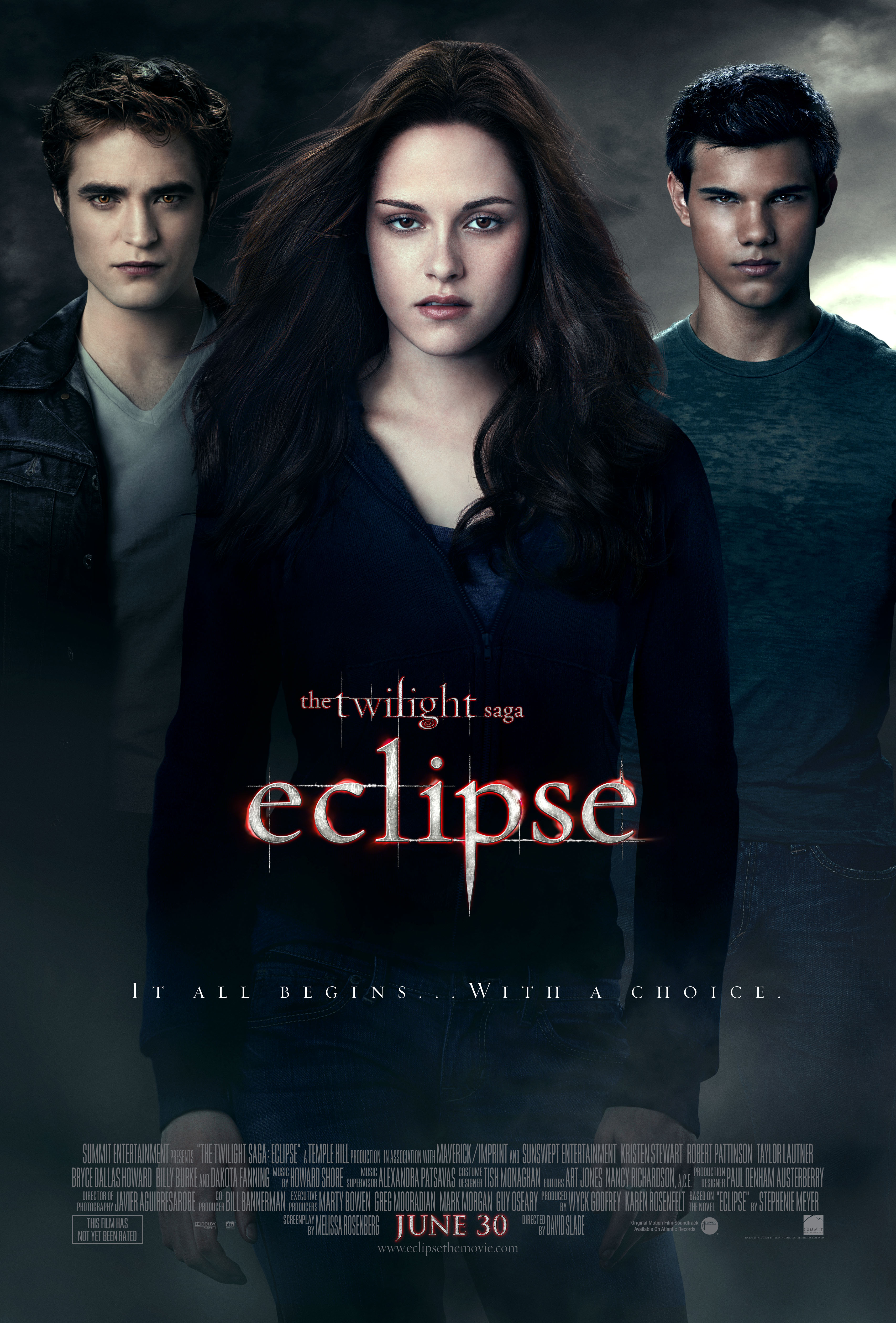
Intertextuality in Genre- Eclipse

Intertextuality in Genre- Eclipse

This twilight saga movie Eclipse has very little swearing, quite a bit of violence, sexual scenes and except for one flashback, it as no drinking. I feel that this film does not have any positive messages to give out to people. This is because, compared to the other two movies, there are passionate kissing scenes involved which are inappropriate for most viewers for the age group. Also, I feel as this movie might influence some teenage girls by having a choice as to what will be the outcome of their future, as Bella did in this third saga. 

The trivia of this film are:

  • Jackson Rathbone's (Jasper) favorite actress is Bryce Dallas Howard who played Victoria in this film. 
  • Kristen Stewart wore a wig for this film after cutting it short for 'The Runaways'. 
  • Robert Pattinson refused to let his eyebrows be plucked or waxed down as they had been in the previous two films. 
These are a few of the trivia for the third twilight saga Eclipse. This helps us understand how much effort was put in to this extraordinary film. For example, they had to make the Cullen house as well as make their own tent set with 'fake' snow to make it seem real, as this setting is ideal for the camp scene. The makers even had to design and build Bella's engagement ring to her liking. 

Thursday, 18 October 2012

Film Making Techniques for Eclipse.

Film Making Techniques for Eclipse

This film 'Eclipse' is an Adventure, Drama and Fantasy based genre. It has lots of action in it and good use of fast moving camera action. This blog is all about the different techniques used in this film and why they have been used. This movie can also be seen as part of my sub-genre, which would probably be vampires. 

In this third episode of Stephanie Meyer's teenage vampire saga, Bella daughter of Forks policeman is still torn between her love for her werewolf best friend and her love bird Edward. She must choose who she wants to be with and who she wants to spend the rest of her 'married' life with. Edward doesn't want to force her into taking any bad decisions. But, there are more problems. There are new enemies around. If the name 'Victoria' comes to mind, then it will automatically come to mind that she is the main root of their problem. She wants to avenge her precious friend James, for Edward had killed him and turned him into ash. Although this movie may seem to be nothing but a fairytale/fantasy, it has used dramatic effects and fast- moving camera shots of Edward especially, emphasising his 'vampire like' ability. 

In this third saga, Jacob kisses Bella and her unknowingly pushes him away and punches him in the face, not knowing that he is as hard as a brick! Edward then gets extremely annoyed and races back to her house. The rivalry between the two carries on from here, until they need to team up (the werewolves and the vampires) in helping protect Bella from getting killed. Only then, does the hottie (Jacob) agree to join their army- for Bella. Edward has a plan to protect Bella from the redhead but do they accomplish it? Sure they eventually sort the redhead Victoria out, but there is more trouble amongst them. They have another rival awaiting Bella...


Monday, 15 October 2012

Newspaper Evaluation Project- the Times

Newspaper Evaluation Project- The Times

The Times Newspaper Front Page (UK) for 3 October 2012Intended Audience

The Gender of the target audience would be targeted at sophisticated males and females who are quite intelligent. This would be the preferred target audience because, The Times is quite factual and has a lot of information inside and out. There are less images and more writing about the different stories around the world. There is no particular race involved as part of the target audience because, all cultures can read a paper like The Times. The age also depends on how factual you like your reading to be. This is also focused on social class people and more upper class people. I would say this because of it looking and being quite factual and with less images would be how that audience would want that newspaper to be like. I feel the intended audience for the Times is less about the age, it is more focused in terms of political beliefs. This newspaper tries its very best to to appeal to fulfil the specific needs its consumers/readers are looking for in this newspaper. 

Founding Ideals

The Times is a British daily national newspaper, first published in London in 1785 under the title The Daily Universal Register. It became The Times on January 1 1788. The Times and The Sunday Times do not share editorial staff, they were founded independently and have only had common ownership since 1967. The Times is the first newspaper to have borne that name, lending it to many other papers around the world, including The Times of India (1838), The New York Times (1851) etc. The Times was founded by publisher John Walter on 1 January 1785. For much of it's early life, the profits of The Times were very large and the competition minimal, so it could pay far better than it's rivals for information or writers. 

 Current news values- how has the Times changed?

Over the years, there have been many changes in the types of machinery used for printing newspapers. Most printing presses no longer use Linotype typesetters or other centuries-old "hot type" technologies. The newer, "cold type" presses are more efficient; they've sped up production and cut costs. From now on, if you want to read The Times or Sunday Times online it is going to cost you. The paper's owner, Rupert Murdoch, has decided that the era of free online content is over. By the mid- 1990s papers were setting up websites as freebie tasters for the real product. Since then, newspaper circulations have been sliding while online reading has climbed. In 2005 the New York Times decided to make its online readers pay for opinion and commenting pieces. 

Newspapers have also changed from the past couple of years by their layout and structure. Back then, newspapers would have been printe din Black & White ink- with mostly text than images. Nowadays, mostly every newspaper is printed in colour and have big catchy headlines and titles. In my defence I feel this has differentiated because of the growth and population in Europe. However, sometimes some people prefer to get updated on their news online rather than buying a newspaper and sitting there at home or in the park or wherever they preferred to read it. This is because, the internet has become so important that literally everything is on there! So most people (especially at work/school/college) tend to read online newspapers in their breaks or free times. But, not all newspapers online are free. Like The Times, Sunday times etc. So it is preferred for The Times to buy their newspapers printed rather than online so you don't have to waste your money every time you visit that site. 

The news values currently from the Times referring to the front cover would be the following:

Negativity- This is because, on the front cover there is an image of the missing girl April Jones who was kidnapped. This shows a negative news value just by looking at the front cover of the Times. 

Closeness to home- This is because, April was kidnapped just from outside her friends house. 

Currency- This story has been going around in newspapers from the minute they found out that she was missing till now, or it may even carry on. April May is in the public eye and people are watching out for her and her kidnapper. 

Personality- This is rare but still is considered to be one of the many news values of this newspaper front cover. This is because, there is also a headline which says  ' BBC yields to pressure over Savile abuse claim'. This and the April Jones story both identify personality of this newspaper by including their names and where April was from/ got missing. 

In my opinion I feel that these are the main areas to include as newspaper values for the Times. 

The Times is considered to be quite factual as well as including eye-catching images and headlines. This also meets the target audience by them being quite upper class with downtime to read this informative newspaper. 

Moral Panics

A moral panic spotted  from the front cover of this newspaper would probably be the 'Savile' headline. This is because it has the word 'abuse' in the headline which automatically creates fear/ eagerness to read what that story is about. 

Ownership- who or what owns the paper and how do they affect the prioritisation of the news reported?

The type of newspaper that the Times is, is a daily newspaper. The owner of the actual newspaper is the News Corporation. The editor of the newspaper is James Harding. The Times newspaper was founded January 1 1785 (227 years, 285 days). The Headquarters of the Times are based in Wapping, London, United Kingdom. The circulation of the Times in June 2012 was 400,120. Other newspapers linked with the Times (sister newspapers) are The Sunday Times. The Times has been around since 1985 still going on in 2012 which makes it 227 years! That is a lot of years. It has been around for a very long time. 

Monday, 1 October 2012

Sub- Genre Conventions & Review of Incidious..

Sub-Genre Conventions of 'Insidious'. 

Insidious Poster

This film 'Insidious' is a horror movie about a boy and a house. But, it's not actually the house that is haunted. It's the boy...

This film is a horror/thriller which explains why there is a scary image of the boy on the movie poster. There has also been a good use of scary sound effects and music. Especially from the start of the film, which already had given me a chill! The events that occurred in this film were tremendously petrifying as were the sound effects that really made me jump. This film is all about spirits and dreams. However, whilst watching this horror based film, there are many events and secrets to uncover. These events being quite frightening and making the audience jump- especially by the sound effects. 

The conventions in this film would be that it has scary sound effects which makes it's audience jump in fright. Another convention would be that it has scary music and figures/shadows used in the specific horror/thriller film. These conventions which make up a horror film are met fully in this thriller. The graphics and faces used in this film builds up frightness and anxiousness as to what is coming next in the film. These were also met by watching the film, and seeing that all of these conventions were present in it. Some more conventions of this particular genre would be, the way most horror films have abandoned houses or isolated mansions present in the setting of the film.